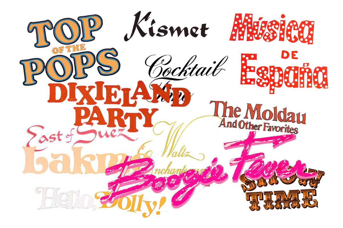
Typography is everywhere. You can’t escape it or ignore it. It’s on your phone, your TV, that packet of ginger biscuits you just polished off with your tea no doubt was prised from a packet with typography on it too. An amble around the Cover Heaven record covers will quickly demonstrate the sheer variety of typefaces used throughout the decades. The development from the fifties to the eighties in the way type looks is clear. It’s always a delight to be able to identify a typeface (aka “font”). One such example is this record cover from 1974.
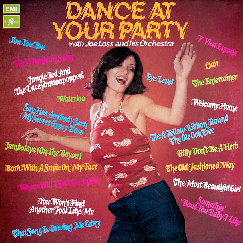
This is “Dance At Your Party” and the title is presented in a cracked-mirror-like type presumably to convey the earth shattering nature of the kind of party you might have were you to dare to place the needle onto this record. The typeface used is in fact Lower Westside also known as LowWe. As a demonstration of how important it is that the typeface is used with the appropriate words, here’s what is looks like when used for this site:

As you can see it doesn’t work well here at all.
Here’s a different typeface altogether as used on Frank Chacksfield’s “Hawaii” LP from 1967. In this record cover we see the use of the typeface “Hobo Std”
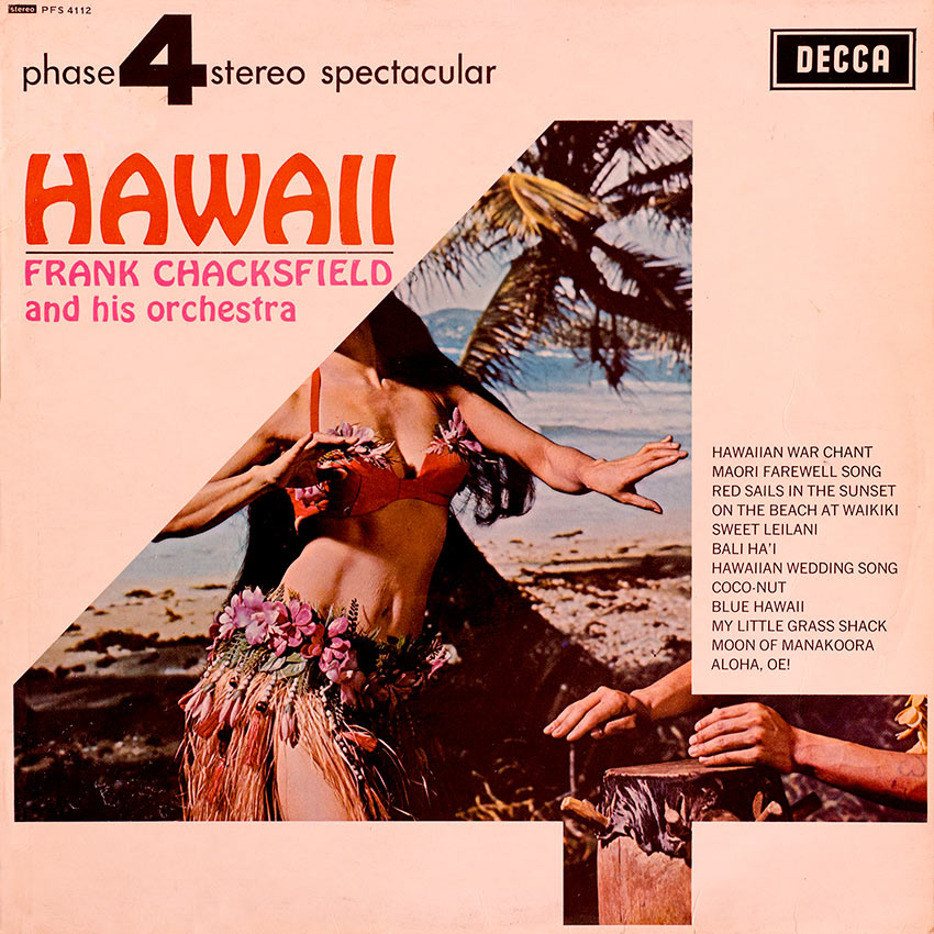
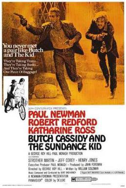
This has been a popular typeface throughout the 20th century and beyond and it may surprise you to learn is was created in 1910. Perhaps its use here was because it has kind of “sway” and a curviness to it, like the palm leaves and hips respectively of fabled Hawaiian life! This typeface may also ring a bell with some of you; maybe you’ll recall its use on this famous film poster.
Again context is everything, here it is as used for this site:

It doesn’t appear quite as ill-suited as the previous typeface but we won’t be swapping it over any time soon!
Have fun checking out the endless typefaces you see on record covers, and everywhere else for that matter.
CH